
 Appventure Games
TravelTech
Appventure Games
TravelTech
Location-Based Navigation Design
Case Study
Designing a singular navigation system that merges digital and real-world environments.
Contents
2. The Problem
3. Design Process
4. The Solution
5. Design & Challenges
6. Learnings & Take Aways
1. Introduction
The Secrets of Barcino: A Geo-Located Adventure in Roman Barcelona
The product blends game mechanics inspired by classic adventure games with history, storytelling, and sightseeing, all set against the backdrop of ancient Roman Barcelona. In The Secrets of Barcino, players—tourists or locals—embark on a unique, immersive adventure, discovering hidden historical sites while solving puzzles and uncovering the city’s rich past. To complete the game, they must navigate through several locations across Barcelona’s Gothic Quarter, each requiring a brief walk.
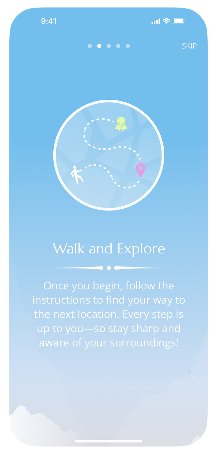
(Real-World) Navigation Design
At each stop, players uncover parts of the narrative, learn about local history, complete challenges, and receive directions to the next destination. This structure forms the core of the experience and is repeated across 12 locations along a predefined route. However, the initial user tests conducted during the MVP phase revealed a gradual decline in engagement as the game progressed.
Repeating the same pattern throughout the entire game exposed several flaws that caused users to lose interest as they moved through the experience, prompting us to approach the problem from different angles—one of which led to a complete redesign of the navigation system.
Lessons from a Hybrid Experience
Overall, it highlights the nuances of developing solutions for a hybrid product that merges digital and real-world environments—a unique challenge that broadened my perspective as a designer.
2. The Problem
User Disengagement and Drop-off
This wasn’t an issue at first, as players would quickly re-engage upon reaching the next destination and uncovering new content. However, each transition acted like a brief disconnection from the experience. Over time—after several stops—these repeated interruptions made it harder to maintain engagement, ultimately leading some players to drop off.
Distractions Along the Route
To understand their impact, we only need to consider the many distractions players encountered while walking through the streets of Barcelona’s Gothic Quarter—often diverted by street musicians, performers, and other attractions along the way. While these elements were generally seen as positive and part of the overall experience, they significantly disrupted immersion by increasing cognitive load and pulling players out of the game.
Navigating the Real World
Unlike a fully digital experience, where immersion is easier to manage, adapting to unexpected events in a constantly changing setting proved challenging. As a result, we shifted our focus to the elements we could influence—such as the map-based navigation system, which revealed an underlying issue we had previously underestimated, ultimately undermining player immersion at its core.
Balancing Difficulty
In practice, the ease of using the map conflicted with a core principle of game design: difficulty must be carefully balanced. When challenges are too easy, the risk of boredom increases. By relying on a map as the navigation system, we unintentionally reduced a key part of the experience—the walk between locations—to a simple, predictable routine. As a result, the lack of difficulty, combined with frequent distractions along the way, gradually pulled players out of the game.
Mockups extracted from the MVP showcasing the three main sections found in the UI while in ‘game mode’. Most of the action, such as the plot, instructions on how to proceed, and the various challenges presented, is displayed within the ‘Actions’ tab (left). The ‘Navigation’ tab (center) shows the map, revealing either the current location or the next destination once a challenge is completed. Additional information about the current location, such as historical facts and other relevant details, is provided within the ‘Information’ tab (right).
3. Design Process
The Job to Be Done
To do so, we considered two possible paths: enhancing the existing map system by introducing more difficulty, or replacing it entirely with a new approach. While improving the current solution would have been the leaner option, we were aware of our bias toward the map-based system. Instead, we chose to develop a completely new solution—one that allowed us to set aside preconceived ideas and focus solely on the job users needed to be done.
Anonymous User Feedback
Original Design
Throughout his career, Gaudí frequently drew inspiration from nature and ancient architecture, which led to his unique and innovative style—reflected in works such as the Temple of La Sagrada Família and Park Güell, among others. This approach encourages thinking outside the box and exploring how similar problems were originally solved—whether by observing how nature has addressed them in various ways or by examining how humans have tackled them throughout history.
Research & Ideation
With Gaudí’s approach to design in mind—and the opportunity to start with a blank canvas—I laid the foundation for the ideation phase. In this process, I distilled navigation to its essence and explored how both nature and humans have approached it over time, uncovering countless sources of inspiration that sparked creativity.
From animals like sea turtles and migratory birds traveling long distances using the Earth’s magnetic field, to sailors navigating with the stars or a compass to find their bearings—this perspective helped broaden our initial idea of what the solution should be, pushing us to move beyond the traditional use of maps and develop an alternative, original approach to geo-located navigation.
Moodboard representing different inspirational elements—from sea turtles, which can detect the Earth’s magnetic field and use it as a natural compass to navigate through the seas, to different types of compasses used by humans. Neptune—both the mythological figure and the planet—helped in conceptualizing the solution from both a storytelling and visual perspective.
Prototyping & Implementation
Once I had a first concept ready to present to the team, we evaluated it from both a design and technical standpoint. We then narrowed the scope to implement a minimum viable version of the solution at the lowest possible cost and designed a series of experiments to validate it—resulting in a basic, functional stand-alone version of the new feature ready for testing.
After completing several experiments and iterations—mostly focused on the functional aspects—we felt ready to move forward and replace the old navigation system with the new one, allowing us to holistically evaluate its overall impact on the user experience.
Testing at Scale: From Demos to Meetup Events
Starting with a demo version of the game—featuring only the first three locations—we began testing the new solution with real users. It turned out to be a long and demanding process, as each session uncovered new issues—some of them critical—that continuously challenged the solution and led to countless testing sessions and iterations.
At a more advanced stage of development, we began organizing Meetup events to test the game with new users and larger groups. These experiments proved effective for evaluating the overall experience in a more realistic context, while also ensuring that participants were in a controlled, ‘safe’ environment—since the product was still unstable and occasionally required on-the-spot human intervention.
4. The Solution
The Compass of Neptune
Bridging the gap between technology and the fictional world of the game—where Roman mythology plays a significant role—we named the new navigation system The Compass of Neptune, a tribute to the Roman god of the sea, revered by sailors for ensuring safe passage and favorable navigation conditions.
The new navigation system retains the elements of a traditional compass, but instead of pointing to magnetic north, this artifact possesses the ‘magical’ ability to discern the immediate destination of its holder.
The arrow, shaped like a fork resembling Neptune’s trident, always points in the correct direction, clearly indicating where the player needs to go next. This continuous guidance acts as a form of ‘divine’ orientation, providing players with a sense of direction while still requiring them to make choices to navigate the right path.
Designed to Fit the Story
The Compass of Neptune is introduced in the first chapter of the game. After completing the first challenge, players are prompted to collect the item by tapping the screen—an item they’ve supposedly found in a grave along the Via Sepulcralis. This action adds the compass to their inventory, allowing them to use it to navigate between locations as they progress through the game.
5. Design & Challenges
Turning Navigation Into Adventure
The Compass of Neptune transformed navigation from a monotonous task into an engaging, challenging activity—turning each route into an adventurous journey through the streets of ancient Barcelona. Players needed to stay focused and make continuous directional decisions, adding both difficulty and immersion to the walk between locations. However, the Compass of Neptune wasn’t an instant success; it was the result of an extensive iterative process, driven by the many challenges we encountered along the way.
Dealing with Obstacles, Misleading Junctions, and Confusion
One common misleading scenario occurred when the trident pointed directly at the entrance of a building, causing initial confusion among players. Even though the doors were usually closed, some players remained puzzled—searching for hidden clues or signs on the door, expecting instructions on how to proceed.
Lost in the Labyrinth
One critical issue, however, was the complete lack of a sense of progress while walking toward the next location. Although the trident consistently pointed in the correct direction, the absence of distance feedback often left players unsure whether they were heading the right way. This made orientation especially difficult within the Gothic Quarter’s labyrinth of narrow streets—often leading to confusion and moments of unfair frustration.
Balancing Usability and Storytelling
This straightforward solution effectively addressed the issue, enabling users to monitor their progress and quickly recognize wrong turns—saving both time and energy while finding the correct route. However, while the solution worked well from a practical standpoint, the numerical display felt somewhat out of place within the overall ‘magical’ aesthetic of the Compass of Neptune.
Not fully satisfied with the initial solution, we continued iterating on the concept and explored other ideas—such as using Roman numerals to display distance. However, we ultimately discarded this approach, as it introduced unnecessary complexity for the player.
Hot and Cold
This approach helps preserve a sense of mystery and reinforces immersion throughout the journey. Additionally, the Compass of Neptune emits a magical twinkling signal at key moments, guiding players to turn at specific junctions where there’s a high risk of deviating significantly from the intended route.
Immersion vs. Awareness
Although the Gothic Quarter is predominantly pedestrian, some routes were crowded with people and shared with bicycles and scooters. In certain cases, players had to cross traffic-calmed streets that were still open to motor vehicles, placing them in potentially dangerous situations.
Navigating Boundaries
Another risk identified, though not physically threatening, arose when the compass pointed directly at an open entrance. This could mislead the player into entering a building directly.
While this typically did not pose a significant issue—most often leading players into museums or public spaces—there were instances where players inadvertently entered private properties, prompting us to intervene. To mitigate these safety concerns, we implemented a disclaimer to warn users about the potential dangers, reminding them to stay alert to their surroundings and avoid entering private areas.
Solving One Problem, Discovering Another
The Compass of Neptune was the result of exhaustive on-the-ground design work. It turned a common feature into something unexpected—transforming navigation into a core, engaging part of the game and contributing meaningfully to a seamless and immersive experience throughout the entire journey.
However, despite these positive results, as more players tried the game, we continued to see a significant drop-off rate. This was largely due to the technical limitations of many mobile devices at the time (2016-2017), which often suffered from GPS inaccuracies or battery-related issues. As a result—despite our countless efforts to mitigate these problems—we were ultimately forced to narrow the game’s technical requirements, excluding a notable number of potential users from enjoying the experience. But that’s a story for another time.
During the Compass of Neptune onboarding, players are introduced to its core features and made aware of the potential risks associated with its use.
6. Learnings & Take Aways
Designing Beyond the Screen
Unlike a fully digital product, where most interactions happen on a screen, working on a hybrid experience like The Secrets of Barcino—which blends the digital and physical worlds—allowed me to empathize with users on a way I hadn’t experienced before.
What Testing in the Field Taught Me
Observing firsthand how users interacted with the game in a real-world environment led to moments of absolute joy, but also genuine embarrassment—especially when their frustration had a real, physical impact. Whether it was walking a long distance before getting lost due to a design decision you’d made, or commuting from another city to play—only to encounter a bug that made the game unplayable—these experiences served as powerful reminders of the responsibility we carry as designers and product developers.
Learning to Test Smarter, Not Harder
These constraints not only pushed us to make every session count—ensuring that each one led to meaningful insights and improvements while minimizing the waste of time and resources, especially for our participants—but also helped us evaluate which experiments truly required user testing and which ones could be reliably assessed internally.
The Final Lesson: Context Is Everything
This process made me more aware of how a single design choice can influence not just the immediate interaction, but also ripple across the broader experience in unexpected ways. As a result, it deepened my understanding of why context is not just a consideration, but a critical component in every design decision.
The Secrets of Barcino featured on Barcelona’s TV channel Betevé, showcasing the Compass of Neptune in action.